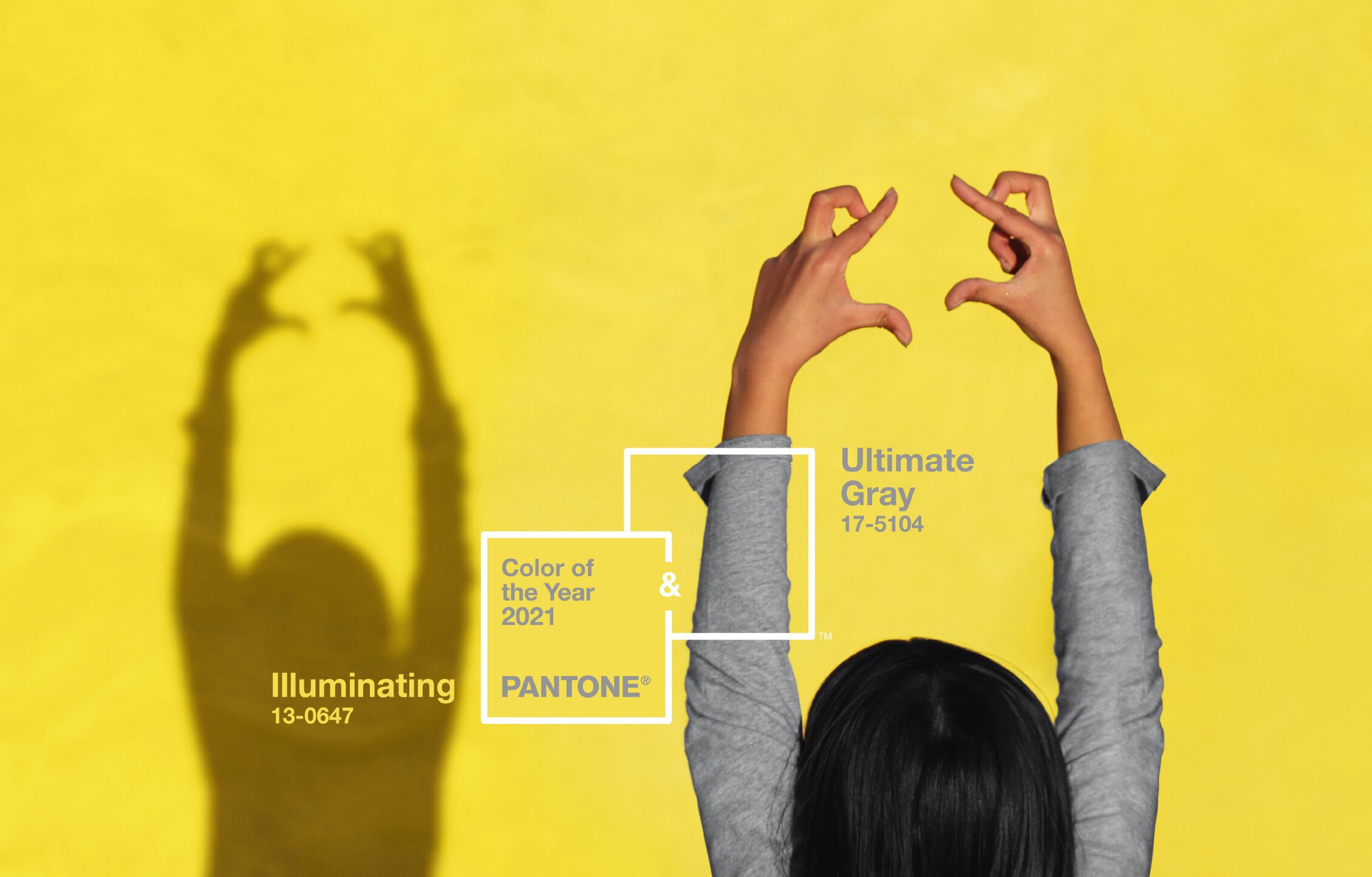
Pantone 2021 Color of the Year Is Here!
Since 2000, Pantone has selected a color of the year to forecast trends in fashion, events, brands and interiors. I had the opportunity to meet with one of the decision-makers years ago and I was so intrigued by the process of this color trend determination. They have a board of people and an AI system that spends the year assessing data based on existing trends in all the design industries globally. From there, they narrow in the final selection into a family of color themes and then the final selection of the “it” color(s) are finalized.
For 2021, the years colors are PANTONE 17-5104 Ultimate Gray + PANTONE 13-0647 Illuminating Yellow. In their release statement, they stated that they found it to be a “marriage of color conveying a message of strength and hopefulness that is both enduring and uplifting.”
Typically only one color is selected, but for the second time in 20 years, they are proceeding with two. Both are opposing colors really. They can stand alone or can work together in a color palette. I personally am always a fan of a classic gray as a neutral. Ultimate Gray is a nice mid-gray that is soft, approachable and versatile. It stands for strength and stability. The yellow is a color best known for joy and happiness, which we all need right now. Fun fact, surprisingly yellow is one of the least favorite colors by people *yuck yellow starburst*, but it is an uplifting color that can change moods and bring hope to the people who view it in their daily lives.
As a graphic designer, I use Pantone colors everyday. They started 58 years ago and have created a universal color code system that allows brands and businesses to communicate the exact color that a printer or designer should use to create consistency. To date, they register over 1,867 solid (spot) Pantone Matching System Colors (also known as PMS colors) for printing ink. These “color tones” are referenced to using a three- or four-digit number followed by a C U (Coated Gloss) or U (Uncoated Matte). Do you have your brand colors in a PMS color code? If not, email me, we will get you hooked up: hello@kaleighwiese.com
As for how you can use it in your brand - proceed with caution. I don’t want you moving fast to a color change on your visual logo and graphic design. Stick to the colors that work for you. However, I want you to lead with bold knowledge of perhaps incorporating some yellow into your craft and art form or gifting people with a pop of yellow and gray to come across knowledgeable and progressive in your color knowledge.
Learn more about the 2021 Color of the year here, and keep an eye out of these two colors in your daily world. Also, if helpful, you can find their full themed Spring/Summer color trend suggestions here.
P.S. If you are interested in learning more about using color in your business, checkout my simple color theory guide to determine if the colors you use in your brand are working for you.

